A curiosity about mixed models and plots
[R-version.
A script corresponding to the discussion below is available for speakers of R: here.]
Overall question
How should we represent experimental data, and how is it influenced by the kind of analyses we present (e.g., ANOVA vs mixed models)?
Situation
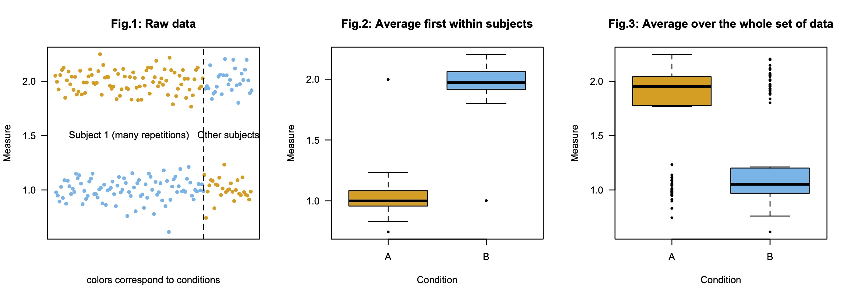
Consider a set of experimental data with N participants, two conditions A and B, but in which one participant (Subject 1) got much more items from each condition than the others. Imagine now that Subject 1 shows a different effect than all other participants. This is illustrated in Fig.1 below. In sum:
- Subject 1 shows (repeatedly) a pattern of response "Condition A (orange) > Condition B (blue)";
- Other subjects show the reverse pattern "Condition A (orange) < Condition B (blue)".
Possible plots
The standard way to report such data visually is the following: for each condition, first average the responses within subject, and then represent the distribution of these average scores (e.g., means and some measure of deviation with error bars). This is what was done in Fig.2. As a result, Subject 1 does not contribute more to that graph than any other subject, its results simply come out as outliers.
Some may think that the first step is unnecessary, and we may simply plot the average of the responses, as in Fig.3. This seems particularly plausible if we think about doing a mixed model kind of analysis, where all datapoints are taken into account, hence we would like to represent them equally, one may think. (All datapoints are not taken into account similarly in more standard analyses, because they are not "independent").
Problem
The problem is that the two plots both suggest that there is a significant effect of condition, but in different directions.
Note about statistics.
Computing ANOVA kind of statistics on the average data of Fig.2 (legal, except possibly for parametric assumptions but they do not matter though because non-parametric tests would give the same output) or on the raw data of Fig.3 (illegal because datapoints within Subject 1 are not independent, ) both yield significant, so much desired p-values, albeit corresponding to effects in different directions (F(1,56)=45, p<1e-08 and F(1,234)=613, p<1e-16, respectively).
Point of view (to be discussed)
The question I mostly want to answer in my experiments is: "If I pick another person from the population, what kind of effect is it likely to show?" (There is no real issue about items here as they are not really defined, but even if there were different items, per subject results and analyses always seem more fundamental to me).
If that's the question we want to answer, then we are interested in Fig.2, not in Fig.3. Hopefully, the statistics you would compute (using a mixed model or not) should be used to spot effects in that direction (if any). Because clearly Subject 1 is an outlier in that case (albeit a robust one).
Back to homepage